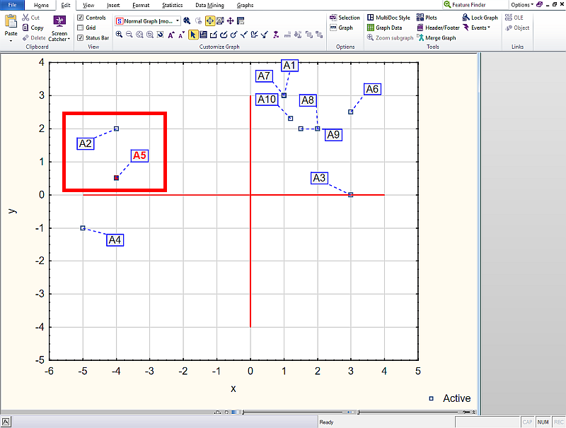
We will start with adjusting the color in the graph, so that each text is color-differentiated. In our case we want the text A5 to be red and bold.
- We select the text in the graph that we want to change.
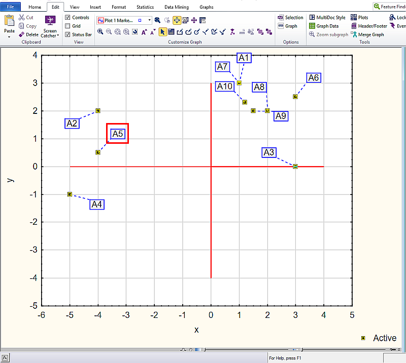
- We right-click it and in the drop-down menu we select Properties.
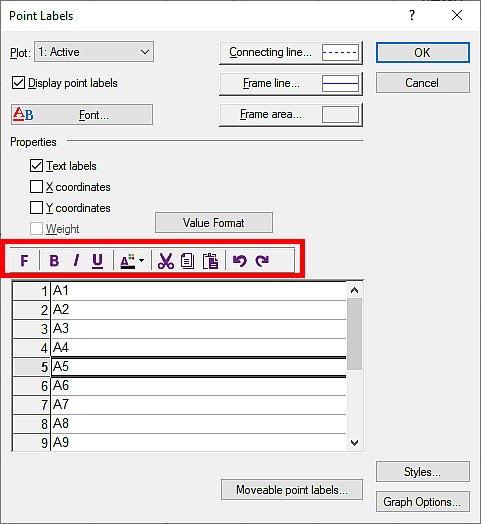
- A dialog box appears, where at the bottom there is a list of variables.
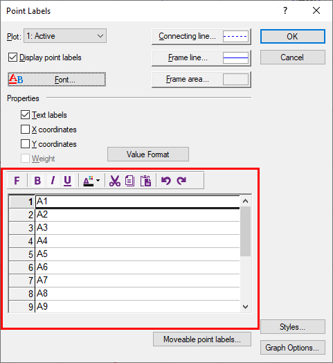
- Here we select the variable we want to change, i.e. A5 (we click the given row to make it active).
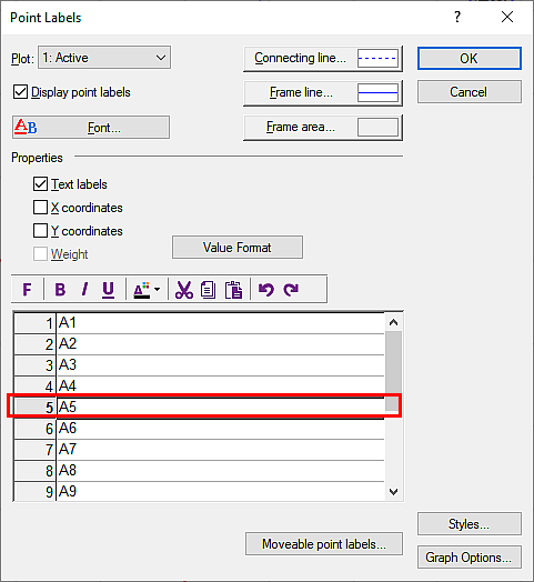
- Then, right at the top, there is a toolbar (B – bold, I – italic, U – underline, right next to it is the font color, etc.) – here we set what we require for the text.
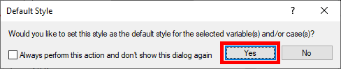
- When we set the necessary things, a dialog box appears asking whether we really want to set our choice as the default for the given variable – we confirm Yes.
- Then we click OK and the text color has changed to red and bold.
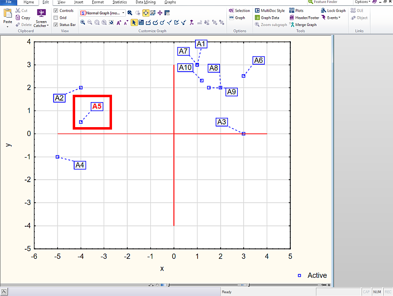
Changing the symbol color
If we want to change the symbol, i.e. change from a blue empty square to another color, then this is a slightly more complicated operation. Here the user has to load images (so, for example, create a blue page, a green page, etc. in Paint). Then save it as .png (.jpg) and then start inserting it. So we will change the point at the A5 marker from the original blue square to red. In the Paint program we prepared a page that is red.
- We select the symbol we want to change.
- We right-click it and choose Properties.
- Here we click the Picture markers button.
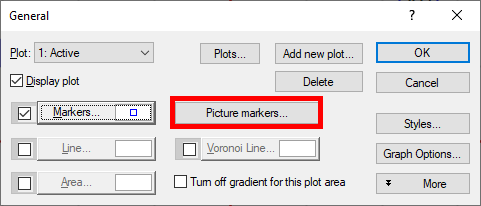
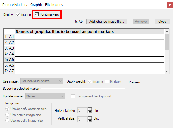
- First we check that in the upper part of the dialog box I have the Point markers checkbox selected (or we select it).
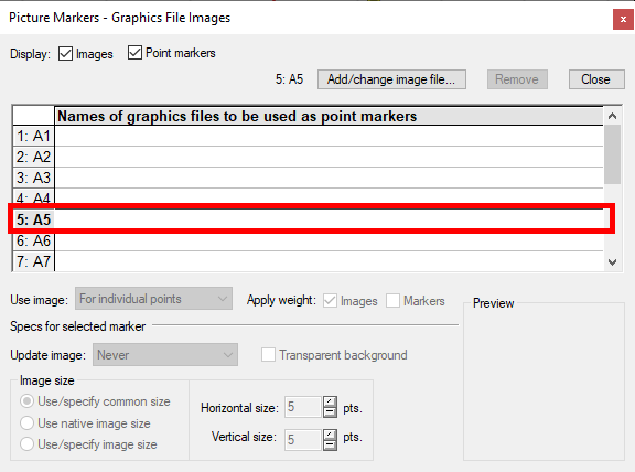
- Now we go to the list of variables and here we select the variable for which we want to change the symbol on the graph.
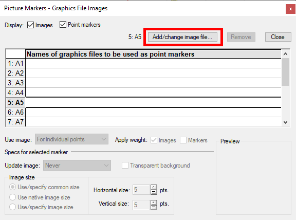
- Then we click Add/Change image file and select from the PC the image we want to replace it with.
- Then at Use image we select the For individual point option and at Image size we select the size (if we want it to remain as a point, we select a size of about 5×5).
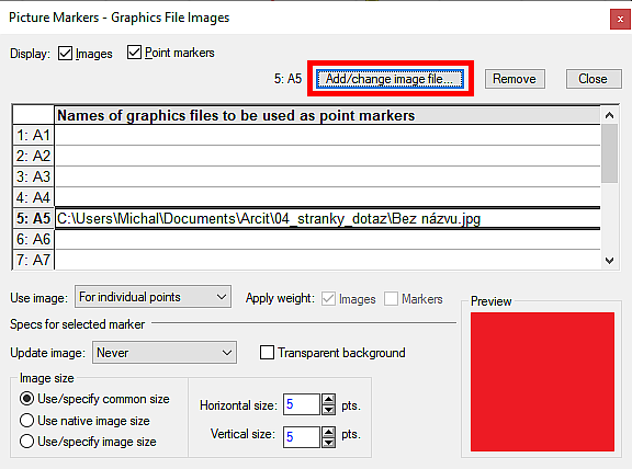
- We choose Close and then OK.
- At this moment the point is set the way we wanted.