Introduction
In this article we would like to address the question of how to recognize, already from a graphical preview, the relationships and dependencies in the analysis of variance. Using the following graphical displays, you should nicely understand what it looks like when individual factors or interactions are significant, and thus also understand the analysis of variance itself a little better. There is no need to be afraid of anything complicated; the goal is only to show the behavior of the data in various situations.
Analysis of variance (ANOVA)
Before we proceed to the graphical displays, let us first summarize what it is actually about. The analysis of variance deals with investigating the relationships between a continuous dependent variable and one or more independent categorical variables (also called factors). Let us give examples of analysis-of-variance problems: examining the influence of the variant of an exam test (A, B, C) on the results achieved by pupils, or the influence of a fertilizer and a given field on the amount of crop at harvest. This is the type of problem we are interested in.
Types of problems
Single-factor ANOVA (one-way ANOVA)
This is what we call the situation where we have only one independent categorical variable (regardless of the number of levels of this variable). If we wanted to decorate the text with a formula, then the equation of such a “regression” model would be:
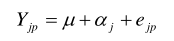
Y denotes the dependent quantitative variable, μ is the reference or overall level (the intercept), αj is the parameter relating to the j-th level of the independent variable, e is the random error. There is also i, which means that for each level of the independent variable you can have several observations.
An example of such a problem could be, for instance, estimating the price of an apartment depending only on which region it is in.
Two-way ANOVA with main effects only
The two-way classification model is slightly more complex, where we add another independent variable. The model is thus as follows:

βg is the parameter for the k-th level of the second explanatory variable.
Two-way ANOVA with interactions
Sometimes the effects of the first and second factors can act in a more complex way and together. Then we speak of a two-way classification model with interactions:

The term λjg has been added, which brings in the joint influence of the first and second factors, so each combination of the levels of these two factors can have a different, unique influence. An example of two-way classification could be examining the influence of the apartment size (2+1, 2+KK, …) and the region on its price. Whether it is a model with or without interactions depends on how the factors act on the dependent variable in the specific case.
Note:
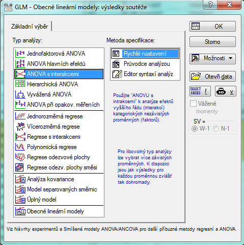
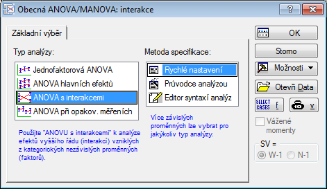
In the Statistica software you will find the individual models either under the button Statistics / ANOVA (this is the simpler option and completely sufficient for our article) or as the first items of the GLM – which is an abbreviation for General Linear Models, which contain more extensive options of linear models, and we find them under Statistics / Advanced Linear/Nonlinear Models in the statistics menu. You enter the three tasks above using the first three items in the window Type of Analysis. We will now try to recognize and describe these situations.
Now, without formulas and simply.
Graphical outputs
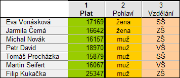
Let us recall that we will be looking at the situation where we explain the dependence of one quantitative characteristic (a continuous dependent variable) on two qualitative variables (factors). To picture everything, let us assume that behind the problem we have the following data: the dependent variable is the salary amount, and the independent variables are gender and educational attainment. All the following data are only illustrative and do not in any way reflect the real state of affairs regarding the salaries of women and men; the names are also fictitious. The source data would therefore be in the form of a table:
One of the outputs of the analysis of variance is a graph of means in the individual groups with the confidence interval for this mean plotted. We will build on this graph in what follows. Why the mean specifically? The analysis of variance has the task of comparing the mean values in the individual groups; the classic estimate of the mean value is precisely the mean, and the analysis-of-variance method also uses it in its calculations.
Let us start with the simplest case:
1. Neither the Gender nor the Education variable influences salary
In the following figure you can see the means and their confidence intervals for all combinations of groups (gender has 2 groups, education 3 groups, six combinations in total, and thus also six means in the graph.)
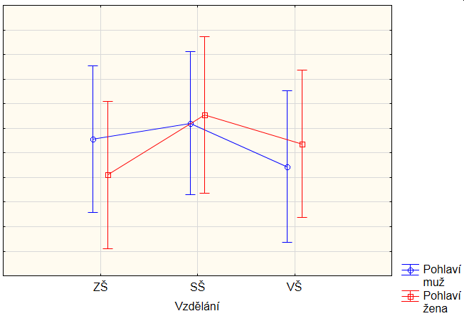
It can be seen that the “whiskers”, or rather the whole intervals, do not differ much – neither the blue ones compared to the red ones, nor do they change in any way together with education. All six intervals overlap a lot. It is therefore a typical example of a situation where the factors have no influence on the dependent variable.
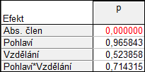
If we computed the analysis of variance for these data and calculated the significance of the coefficients in the two-way model with interactions, it would turn out, as expected, that no variable or interaction is significant. Only the intercept is significant, which is essentially a kind of level around which all the data lie on average, and since these are salaries, this level will certainly not be around 0. In other words, we reject the hypothesis that the model intercept is equal to 0.
Note: If you did not know how to produce the graph and the results above, follow the guide below: open the Statistics / ANOVA – ANOVA with interactions / OK. dialog. Choose the variables: Salary as the dependent one and Gender and Education as categorical factors. We click OK and we have the results. Under the Effect sizes we call up the significance tests. With the All Effects / Graphs button we produce the graph. The exact settings for the graph:
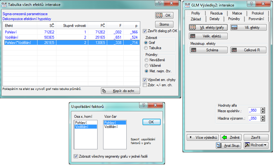
This graph can also be produced without the analysis of variance via the Graphs tab; it is the Means with Error Bars graph. As the grouping variable you need to choose Education and on the Categorized tab activate the variable for the X categorization and set it to Gender, and additionally choose the overlaid layout.
2. The Gender variable has an influence, but Education has none
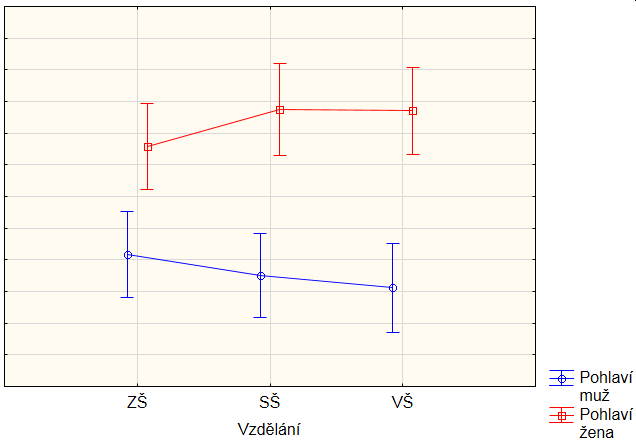
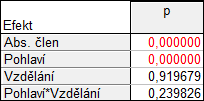
It can be seen that the levels are different for the different genders – the interval profiles for men and for women are even completely separated. If we take men separately, their salary stays at the same level (the intervals overlap a lot), and similarly for women, so the influence of education is negligible; see the results of the significance tests of the factors:
3. The Gender variable has no influence, but Education does
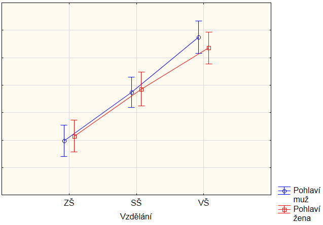
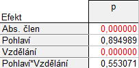
This situation is very similar to the previous one, only graphically it looks different, because now we have the difference in the quantity that is directly on the axis, and not in the quantity distinguished by colors. There is probably not much to explain: the levels for education differ (in general they do not have to only rise, as in the figure; they can just as well be “broken” or decreasing profiles). Whereas the levels for gender within each education level are almost the same.
4. Both the Gender variable and the Education variable have an influence
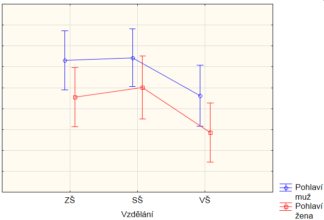
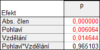
If a situation arises where the profiles in the graph for the individual genders (in our case the blue and red graphs) have the same shape but are shifted from each other for the individual genders, then it is the influence of both independent quantities at the same time. The less significant the interaction, the more the profiles have the same shape. In this case, therefore, there can be no question of an interaction influence.
5. Significant influence of the interaction
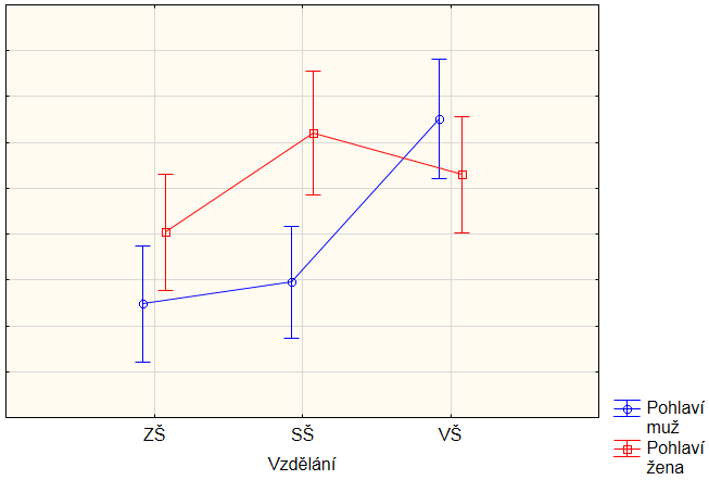
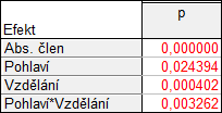
The most complex situation arises when the interaction also has an influence, which means that each combination of factors can have its own unique level. We recognize this situation from the figure by the fact that the profiles for the individual genders are no longer the same, in other words, that the curves bend differently for each gender.
Summary
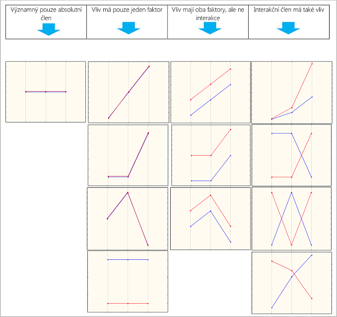
Our goal was to show the situation and to help a little with understanding the two-way analysis-of-variance model. Of course, it is necessary to point out that it is not appropriate to decide based on graphs alone; nevertheless, they can be a good guide for you and a presentation of what is happening in the data. In conclusion, we would summarize the theoretical profiles for the individual situations – that is, really only with the influences we are examining. We consider the others to be zero, which does not happen in practice; nevertheless, at least it nicely shows what the individual influences can do to the means (again we consider 2 factors, one having 3 levels and the other two).